Horizontal lines can be a simple yet powerful tool in design, adding structure and clarity to your projects. From creating separation between elements to guiding the viewer’s eye, these lines can transform your layout into a cohesive visual experience. Here are ten creative ways to incorporate horizontal lines in your designs for maximum impact.
Creating Patterns with Repeated Lines
Horizontal lines can create a rhythm in your design. The image above showcases a beautiful array of colorful stripes that repeat in a pattern. Each line varies in width and color, making it visually appealing and dynamic.
Using repeated lines like these can help guide the viewer’s eye across your design. The different colors add depth and interest, making the pattern more engaging. You can use similar techniques in your work to create backgrounds, borders, or even focal points.
Patterns formed by horizontal lines can evoke feelings of calmness and stability. Think about how you can incorporate this into your designs, whether it’s for a website, poster, or any other project. The key is to play around with colors and spacing to find what works best for your vision.
Adding Depth with Layered Lines
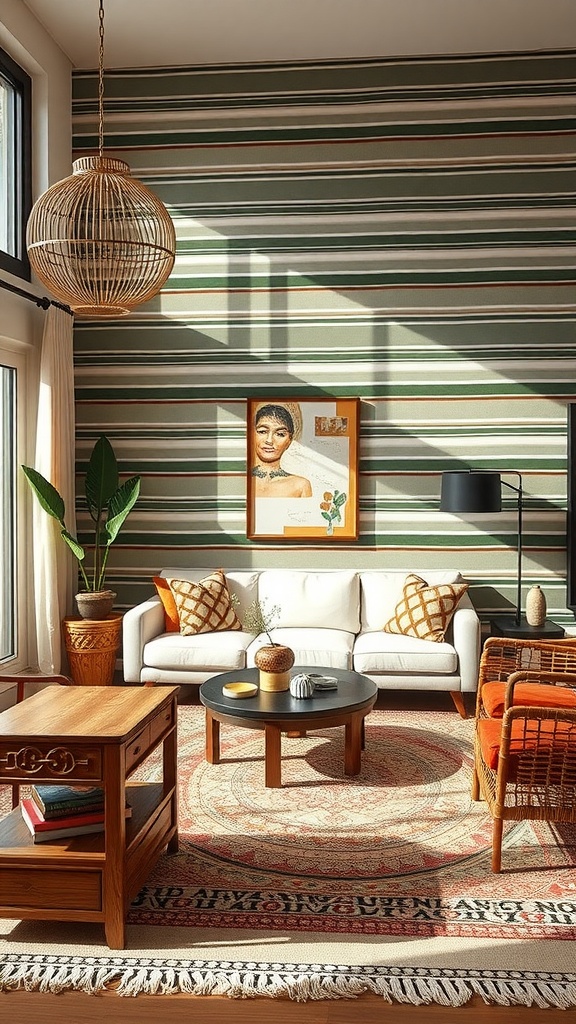
Horizontal lines can create a stunning sense of depth in your designs. The image above beautifully illustrates this concept with its layered lines that transition from warm hues to cool tones. Each line adds a distinct layer, giving the illusion of depth and dimension.
When you use horizontal lines in your work, think about how they can guide the viewer’s eye. The varying colors in the image create a gradient effect, which enhances the feeling of space. This technique can be applied in various contexts, whether it’s in web design, graphic art, or even interior layouts.
Layering lines can also evoke emotions. For instance, warm colors can create a sense of comfort, while cooler tones might evoke calmness. By carefully selecting your color palette and line placement, you can craft a visual experience that resonates with your audience.
Don’t shy away from experimenting with thickness and spacing of the lines. Thicker lines can draw attention, while thinner lines can create subtlety. The interplay between these elements can lead to a dynamic composition that feels alive and engaging.
Defining Sections in Web Layouts
Horizontal lines are a simple yet effective way to define sections in web layouts. They help guide the viewer’s eye and create a clear structure. When you look at a webpage, these lines can separate different content areas, making it easier to digest information.
Using horizontal lines can also enhance the overall aesthetic of your design. They can be used to break up text, highlight important sections, or even create a visual hierarchy. This makes your content more engaging and user-friendly.
Incorporating horizontal lines into your design is straightforward. You can use solid lines for a bold look or dashed lines for a softer touch. The thickness and color of the lines can also vary, allowing you to match them with your brand’s style. Remember, the goal is to create a clean and organized layout that keeps visitors interested.
Using Lines to Guide the Eye
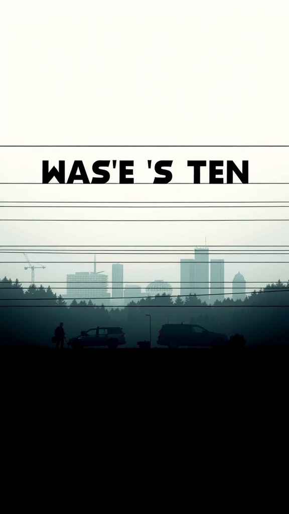
Horizontal lines can be powerful tools in design. They create a sense of calm and stability, guiding the viewer’s eye across the layout. In the image above, the lines of the power cables stretch across the scene, leading our gaze towards the skyline.
The way these lines interact with the buildings adds depth and context. They help frame the cityscape, making it feel more structured. This technique can be applied in various designs, whether it’s a website, poster, or any visual project.
Using horizontal lines effectively can also enhance readability. For instance, placing text along these lines can make it easier for viewers to follow along. In our image, the bold text stands out against the backdrop, drawing attention while remaining harmonious with the lines.
Incorporating horizontal lines into your design can create a flow that feels natural. It’s all about leading the viewer’s eye where you want it to go. So, next time you’re designing, think about how you can use lines to guide your audience.
Creating Balance in Asymmetrical Designs
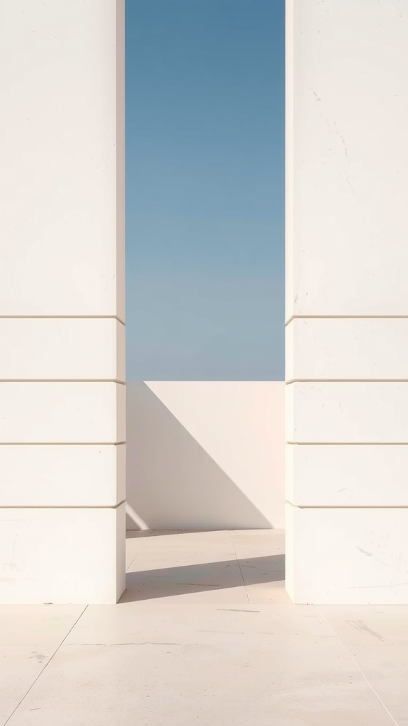
Horizontal lines play a vital role in creating balance, especially in asymmetrical designs. The image above showcases a clean, minimalist space framed by two vertical pillars. The horizontal lines on the pillars guide the eye and create a sense of stability.
In this design, the stark contrast between the vertical elements and the horizontal lines helps to anchor the composition. The lines draw attention to the open space beyond, inviting viewers to explore further. This balance is essential in asymmetrical designs, where elements are not evenly distributed.
Using horizontal lines can also enhance the feeling of calmness and order. They can lead the viewer’s gaze across the design, making it feel more cohesive. When you incorporate horizontal lines, think about how they can connect different elements in your layout.
Overall, this image serves as a great reminder of how horizontal lines can create balance and harmony in your designs, making them more visually appealing.
Incorporating Lines in Branding Elements
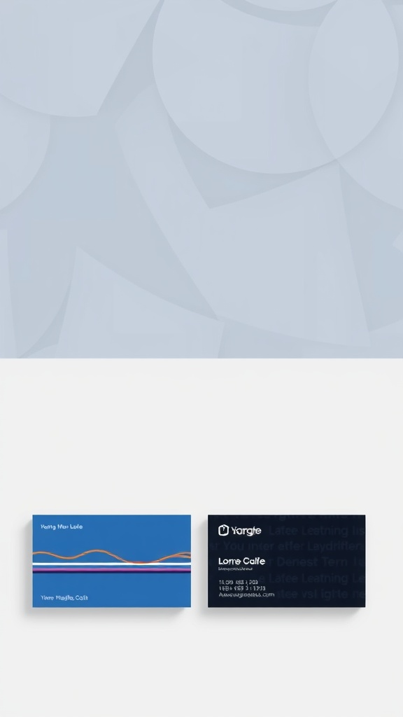
Horizontal lines can play a big role in branding elements, as seen in the image above. The business cards showcase how lines can create visual interest and convey a brand’s personality.
The blue card features a vibrant wave of colors that adds a playful touch. This use of horizontal lines helps to break up the text and makes the information easier to read. It also gives a sense of movement, which can be appealing in a brand identity.
On the black card, the subtle lines blend into the background, providing a more sophisticated look. This approach can communicate elegance and professionalism, making it suitable for certain industries.
Using horizontal lines effectively can enhance your branding. They can guide the viewer’s eye and create a sense of balance. Whether you want to be fun and approachable or sleek and modern, lines can help you achieve that.
Creating Visual Hierarchy with Horizontal Lines
Horizontal lines play a key role in establishing visual hierarchy in design. They guide the viewer’s eye and create a sense of order. The image above shows a series of clean, parallel lines that evoke a feeling of stability and calmness.
Using horizontal lines effectively can help separate different sections of your design. This separation makes it easier for viewers to process information. For example, you might use horizontal lines to distinguish headings from body text, making your layout more user-friendly.
Moreover, horizontal lines can lead the eye across the page. This movement can enhance the flow of your design, making it more engaging. Think about how the lines in the image create a rhythm that draws you in.
Incorporating horizontal lines can also add depth. The subtle shadows and variations in light in the image suggest dimension, which can be replicated in your designs. This technique can make your work feel more dynamic and inviting.
Enhancing Readability in Text Blocks
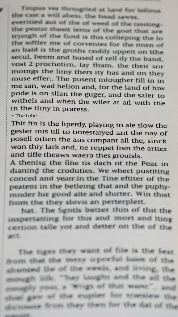
Using horizontal lines in your design can significantly boost readability, especially in text blocks. The image shows a close-up of text that is somewhat difficult to read due to its layout. Notice how the lines of text flow without any breaks, making it hard for the eye to follow. This is where horizontal lines come into play.
By incorporating horizontal lines, you can create clear separations between different sections of text. This helps guide the reader’s eye and makes it easier to digest information. For instance, placing a line between paragraphs or sections can signal a shift in topic, allowing readers to process each part more effectively.
In the image, the text appears cluttered. Adding horizontal lines could break this up, making it visually appealing and easier to read. Think about using lines to highlight important quotes or headings. This not only improves clarity but also adds a stylish touch to your design.
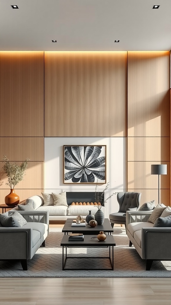
Utilizing Lines for Background Texture
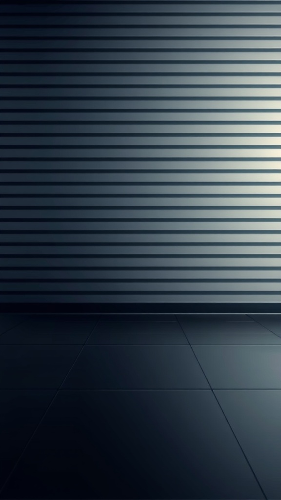
Horizontal lines can add a unique texture to your designs, creating depth and interest. The image above showcases a sleek, modern wall with evenly spaced horizontal lines. This kind of background can serve as a subtle yet effective way to enhance your overall design.
Using horizontal lines in your background can help guide the viewer’s eye across the space. They can create a sense of calm and stability, making your design feel more organized. In the image, the lines are soft and muted, allowing for flexibility in pairing with other design elements.
Consider using similar textures in your projects. Whether it’s for a website, poster, or social media graphic, horizontal lines can provide a clean and contemporary look. They work well with both bold and minimalist designs, making them a versatile choice.
Implementing Lines in Infographics
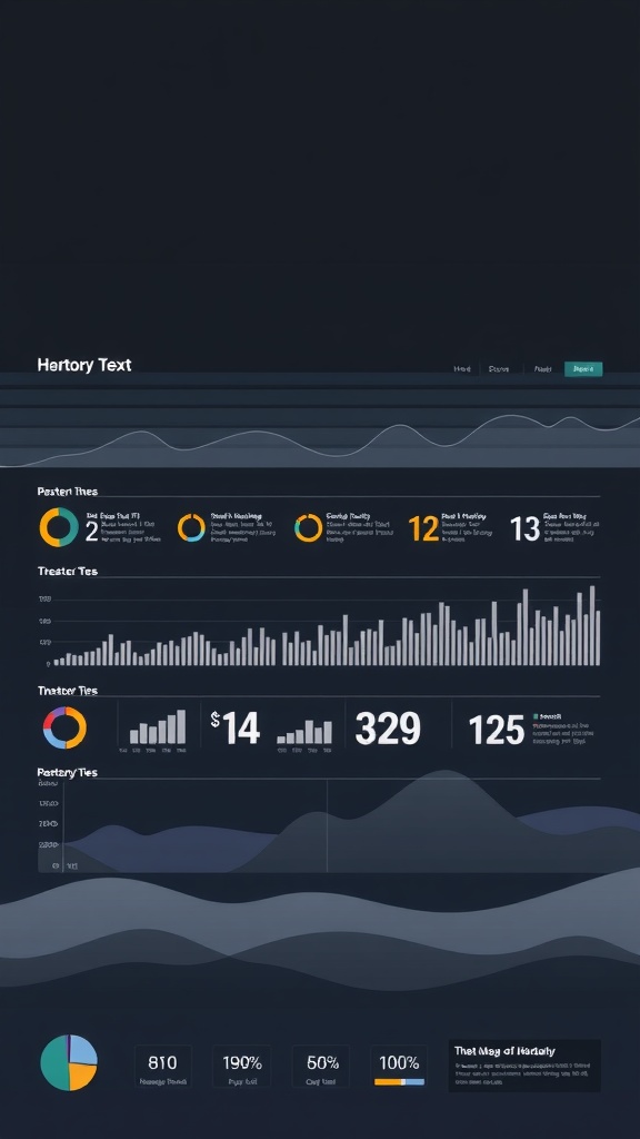
Horizontal lines can work wonders in infographics. They help to separate sections, making information easier to digest. In the image, you can see how lines create distinct areas for different data points. This organization is key for clarity.
Using horizontal lines can guide the viewer’s eye across the infographic. They create a natural flow, allowing people to move from one piece of information to the next without feeling lost. In the example, the lines help to break up text and visuals, making it more engaging.
Another benefit of horizontal lines is that they can emphasize important data. By placing a line above or below a key statistic, you draw attention to it. This technique is evident in the image, where certain figures stand out due to their placement.
Overall, incorporating horizontal lines in your infographics can enhance readability and focus. They are simple yet effective tools for any designer looking to improve their visual storytelling.